Smart Digital Experiences


The Project
One Passion. Many People.
Bielscy Motocykliści is a motorcycle association from the Podbeskidzie region, bringing together riders who share group rides, rallies and trips throughout the season. Beyond the road, the community is active locally too — running educational initiatives on road safety and supporting charity causes.
As the association's activities grew — bigger events, recurring campaigns, a flagship charity calendar — the need was to give all of it, from a single social post to a two-day festival, one consistent visual voice.
Industry
Non-Profit · Motorcycle Community
Language
Polish
year
2023-2026
Live
What I Did
✦Event Brand Identity✦Print & Campaign Materials✦Calendar Art Direction✦Anniversary Emblem✦Merchandise Design✦Social Media Graphics
The Work
From a Flagship Event to a Record-Breaking Calendar
The collaboration began with the flagship charity calendar. Its limited, premium-quality edition had its own premiere at a vernissage — complete with a photo exhibition and a banquet — and also earned the association a table at a separate, larger city event at Cavatina Hall, presenting and selling the calendar to guests in front of roughly a thousand people. It was the loudest the association's calendar had ever gone. That same year, the work continued into full event branding for Moto Pałac Weekend — the association's biggest live event to date, at Pałac Larischów.
After that, the work together became occasional rather than constant — until Bielscy Motocykliści came back for one more milestone: a 10th-anniversary emblem, marking ten years of the association.
Below is the full range of what that work included.
The Starting Point
The association's own black-and-red identity — name, colours and a wing-and-wheel mark — served as the starting point. The task was to extend that visual language across a growing range of one-off event and campaign materials, keeping every piece consistent.

The association's own logo, in ongoing use — not part of this project's scope.
Building the Event Mark
Moto Pałac Weekend needed its own identity — distinct enough to stand on its own, but unmistakably part of the Bielscy Motocykliści family. The mark went through the usual arc: a handful of directions, one clear favourite, then refinement until it worked as small as a wristband and as large as a billboard.
Sketch to Final Mark




Campaign Materials
Poster, tickets, gift voucher and pricing graphics for Moto Pałac Weekend.


10th Anniversary Emblem
Ten years called for something that felt earned rather than decorative — a seal-style emblem built around the association's existing colours, with a gold accent reserved for this milestone alone. I also put together an early header concept for the event announcement.
For this round, I took on only the emblem — my schedule was already committed elsewhere, so the full set of event materials went to another designer. The emblem carried through anyway — appearing on t-shirts, a metal badge and mugs at the association's second Moto Pałac Weekend.


Deliverables
Event logo, key visual & full event identity
Print & campaign materials (poster, tickets, flyer, voucher, press wall, schedule)
Social media graphics
10th anniversary emblem
Calendar concept, art direction & 12 monthly designs
Exhibition prints & vernissage invitation
Branded t-shirts (men's & women's)
Ongoing social graphics
The Calendar Project
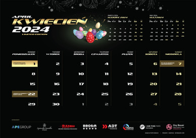
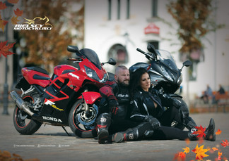
Twelve months, one creative direction, and a full season of photoshoots — planned, art-directed and designed from concept to print, shot by the talented photographer Piotr. Each month was styled around a holiday or date that actually fell within it, which meant Photoshop had to work overtime: all twelve sessions were shot in the height of summer, so that "snowy" December owes a lot more to retouching than to weather. (Look closely at October — that's me, riding alongside a friend.)
Alongside creative direction, I helped coordinate the shoot locations with other members of the group, and personally brought in most of the calendar's sponsors — a significant part of what made the fundraising possible.
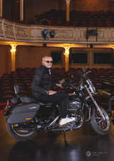
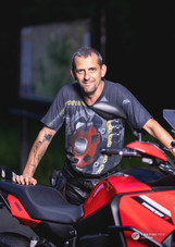
Printed calendar spreads month by month and a few favourite frames that didn't make the final cut.
















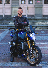


Photography: Piotr Bracki
The calendar got its own premiere at a vernissage: a photo exhibition, large-format canvas prints of the shoots, a banquet, and a meeting with Zuzia, the girl the fundraiser was for. It also earned the association a table at a separate, larger city event at Cavatina Hall, where it was sold to guests and mentioned from the stage in front of roughly a thousand people. Between the two, this became the project's biggest fundraising moment: 20 000 zł raised for Zuzia's treatment.
The calendar's table at a separate city-wide event, seen by roughly a thousand people.

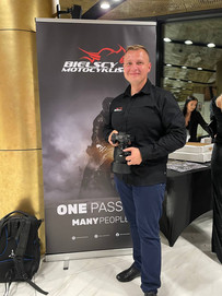





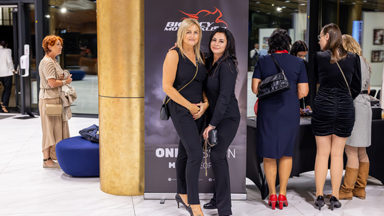


Photography:
Piotr Bracki
Agnieszka Zawadka
Photos from the calendar's own premiere event, plus the invitation design.





Photography:
Piotr Bracki
Agnieszka Zawadka
Video - Behind the Scenes.
A short film documenting the year's photoshoots — shown at the vernissage, with thanks to everyone who helped make it happen.
Merch
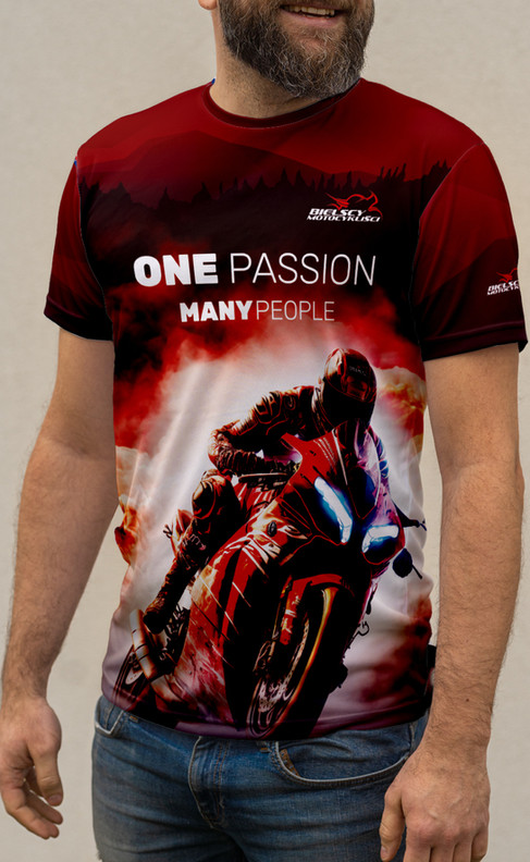
Branded T-shirts for members — a men's and a women's version, fully custom-designed front and back, not just a logo slapped on a blank shirt.
T-Shirts in Use




The Result
One system now carries the company from business card to billboard.
↗
Seen and heard at a city-wide event
↗
Trusted to return for the association's 10-year milestone
↗
Helped raise 20 000 zł for a real cause
Client feedback
“
