Smart Digital Experiences


The Project
A solid industrial brand built to feel strong, reliable, and professional
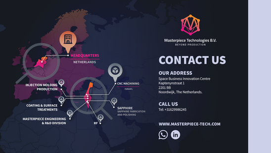
Masterpiece Technologies is an innovative technology company with operations in Israel and headquarters in the Netherlands. They came with a clear ambition — to look as serious and credible as the technology they were building.
Since this project, the client has rebranded as Masterpiece Innovations B.V. — same team, same work, new name.
Industry
Aerospace
Communication
Semiconductor
Medical
Language
English
Dutch
year
2021–2024 · ongoing
What I Did
✦Brand Strategy✦Logo Design✦Visual Identity✦Brandbook✦Website Creation✦Presentation Design✦Print & Trade Show✦Graphic Materials
The Work
Building a Complete Visual System
The Starting Point
A technology company operating across six industrial sectors needed a mark that felt precise, systematic, and international from day one — not a startup logo, but something that could sit on a trade show booth and a business card with equal weight.
Finding the Mark
Three directions were explored before landing on the final mark — each pushing toward something more universal than any single industry the client serves.
Directions Explored
Direction 1 — Letter + Circuit

An early direction fused the "M" with circuit-board pins — direct, but read as purely electronics, too narrow for a company spanning aerospace, medical, and industrial technology.
Direction 2 — Industrial Gear

A more mechanical exploration, built on gear teeth to signal manufacturing precision — strong, but felt closer to heavy machinery than to R&D and innovation.
Direction 3 — Connected Network

The direction that stuck: an abstract hexagonal network. Six connected points for six industries served, with the interlacing lines standing for the process itself — research, development, and connection between disciplines.
The final mark


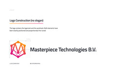
A geometric, gradient-driven mark — technical enough to feel engineered, abstract enough to belong to any industry the company serves.

Colour & Typography
A gradient from orange to pink signals energy and movement, paired with a clean geometric sans that keeps everything feeling engineered, not decorative.

Brand Book
Guidelines covering logo usage, colour, typography, and stationery — so the identity stays consistent across every future touchpoint, not just the ones built here.

Inside the brand book




In Use
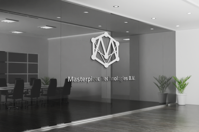
From office signage to trade show booths — the mark holds up at any scale, in any medium.
Website
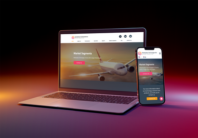
The identity carried through to a full multi-page site.
Print Materials
Business cards, letterheads, and stationery — consistent across every physical touchpoint.
Presentations
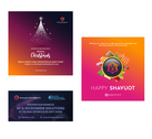
Decks built for investors, partners, and industry events — same system, different audiences.
Catalogue
A printed catalogue presenting the full technology range.
Trade Show
Booth design and on-site graphics for international exhibitions.
H4 Video
A branded video introducing the company












Deliverables
Logo — all formats (PNG, SVG, PDF)
All versions: H, V, monochrome
Colour palette + typography
Mini brandbook / usage guide
Business card design
Email signature
Social media template (Canva)
A4 letterhead
Source files (AI)
Full rights after payment
The Work
Building a Complete Visual System
The Starting Point
A technology company operating across six industrial sectors needed a mark that felt precise, systematic, and international from day one — not a startup logo, but something that could sit on a trade show booth and a business card with equal weight.
Finding the Mark
Three directions were explored before landing on the final mark — each pushing toward something more universal than any single industry the client serves.
Directions Explored
Direction 1 — Letter + Circuit
An early direction fused the "M" with circuit-board pins — direct, but read as purely electronics, too narrow for a company spanning aerospace, medical, and industrial technology.
Direction 2 — Industrial Gear
A more mechanical exploration, built on gear teeth to signal manufacturing precision — strong, but felt closer to heavy machinery than to R&D and innovation.
Direction 3 — Connected Network
The direction that stuck: an abstract hexagonal network. Six connected points for six industries served, with the interlacing lines standing for the process itself — research, development, and connection between disciplines.
The final mark
A geometric, gradient-driven mark — technical enough to feel engineered, abstract enough to belong to any industry the company serves.
Colour & Typography
A gradient from orange to pink signals energy and movement, paired with a clean geometric sans that keeps everything feeling engineered, not decorative.
Brand Book
Guidelines covering logo usage, colour, typography, and stationery — so the identity stays consistent across every future touchpoint, not just the ones built here.
Inside the brand book
In Use
From office signage to trade show booths — the mark holds up at any scale, in any medium.
Website
The identity carried through to a full multi-page site.
Print Materials
Business cards, letterheads, and stationery — consistent across every physical touchpoint.
Presentations
Decks built for investors, partners, and industry events — same system, different audiences.
Catalogue
A printed catalogue presenting the full technology range.
Trade Show
Booth design and on-site graphics for international exhibitions.
H4 Video
A branded video introducing the company
The Result
A system built once, still carrying the brand through every new stage of growth.
↗
Looks more professional online and offline
↗
Customers trust us more
↗
More inquiries and interest
Client feedback
“
Oksana did an excellent job. I highly recommend her — very professional, practical, and fast. She was part of our core thinking team and had a lot to contribute, especially in the early stages of product development.
Yaniv Yiron
Founder · Masterpiece Innovations B.V.
