Smart Digital Experiences
Główna → Portfolio →
Główna → Portfolio →
Masterpiece Technologies
Masterpiece Technologies
Firma technologiczna z dużym potencjałem, ale bez pasującego do niego systemu wizualnego. Potrzebowała wizerunku, który będzie komunikował innowacyjność, precyzję i globalne ambicje, zarówno w materiałach cyfrowych, jak i fizycznych.
Brand IdentityPresentation DesignUX/UIWebsite CreationBrand GuidelinesEvent IdentityVisual IdentityGraphic Design
Projekt
Solidna marka technologiczna stworzona tak, aby wyglądać profesjonalnie, wiarygodnie i pewnie
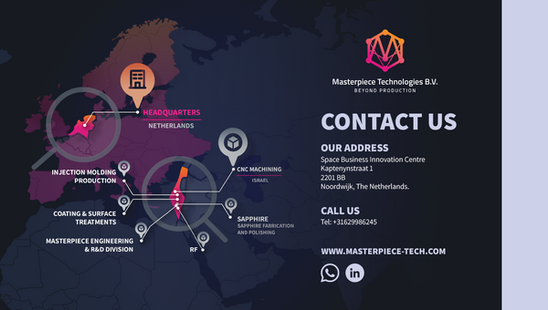
Masterpiece Technologies to innowacyjna firma technologiczna działająca w Izraelu, z siedzibą główną w Holandii. Firma zgłosiła się do mnie z jasnym celem: jej wizerunek miał być równie profesjonalny i wiarygodny jak technologia, którą rozwijała.
Od czasu realizacji tego projektu firma zmieniła nazwę na Masterpiece Innovations B.V. Ten sam zespół, ta sama działalność, nowa nazwa.
USŁUGI WYKORZYSTANE W TYM PROJEKCIE
✦Strategia marki✦Projekt logo✦Identyfikacja wizualna✦Brandbook✦Projekt i stworzenie strony internetowej✦Projektowanie prezentacji✦Materiały drukowane i targowe✦Materiały graficzne
Proces projektu
Budowanie kompletnego systemu wizualnego
Punkt wyjścia
Firma technologiczna działająca w sześciu sektorach przemysłu potrzebowała znaku, który od początku byłby precyzyjny, uporządkowany i międzynarodowy. Nie logo typowego startupu, ale znak, który równie dobrze prezentuje się na stoisku targowym, jak i na wizytówce.
Poszukiwanie znaku
Przed wyborem finalnego znaku opracowałam trzy różne kierunki. Każdy z nich prowadził w stronę rozwiązania bardziej uniwersalnego niż pojedyncza branża, w której działa klient.
Opracowane kierunki
Kierunek 1 — Litera + obwód

Pierwszy kierunek łączył literę „M” z elementami płytki drukowanej. Pomysł był czytelny, ale zbyt mocno kojarzył się wyłącznie z elektroniką, przez co nie pasował do firmy działającej także w branży lotniczej, medycznej i technologii przemysłowej.
Direction 2 — Industrial Gear

Bardziej mechaniczny kierunek, oparty na formie koła zębatego, miał podkreślać precyzję produkcji. Był mocny, ale zbyt blisko kojarzył się z ciężkim przemysłem, a za mało z badaniami, rozwojem i innowacją.
Kierunek 3 — Połączona sieć

To właśnie ten kierunek został wybrany: abstrakcyjna, sześciokątna sieć. Sześć połączonych punktów symbolizuje sześć obsługiwanych branż, a przecinające się linie przedstawiają sam proces: badania, rozwój oraz łączenie różnych dziedzin.
Finalny znak


Geometryczny znak oparty na gradiencie. Wystarczająco techniczny, aby wyglądać jak precyzyjnie zaprojektowany, a jednocześnie na tyle abstrakcyjny, by pasować do każdej branży obsługiwanej przez firmę.

Kolorystyka i typografia
Gradient od pomarańczu do różu symbolizuje energię i ruch. Został połączony z prostym, geometrycznym krojem bezszeryfowym, dzięki któremu całość wygląda technicznie i precyzyjnie, a nie dekoracyjnie.

Zakres dostarczanych materiałów
Logo we wszystkich formatach (PNG, SVG, PDF)
Wszystkie wersje: pozioma, pionowa i monochromatyczna
Paleta kolorów + typografia
Mini brandbook / zasady stosowania
Projekt wizytówki
Stopka e-mail
Szablon do mediów społecznościowych w Canva
Papier firmowy A4
Pliki źródłowe AI
Przeniesienie pełnych autorskich praw majątkowych
Brandbook
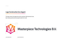
Wytyczne dotyczące stosowania logo, kolorystyki, typografii i materiałów firmowych, dzięki którym identyfikacja pozostaje spójna także w przyszłości, nie tylko w materiałach przygotowanych w ramach tego projektu.

Wewnątrz brandbooka




W praktyce
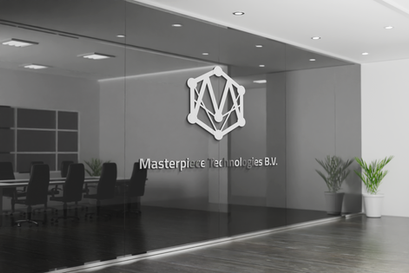
Od oznakowania biura po stoiska targowe, znak pozostaje czytelny i spójny w każdej skali i na każdym nośniku.
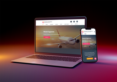
Strona internetowa
Identyfikacja została rozwinięta również na pełną, wielostronicową stronę internetową.
Materiały drukowane
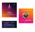
Wizytówki, papier firmowy i materiały biurowe, spójne w każdym fizycznym punkcie kontaktu z marką.
Prezentacje
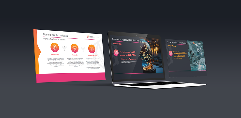
Prezentacje przygotowane dla inwestorów, partnerów i na wydarzenia branżowe. Jeden spójny system, różni odbiorcy.
Katalog
Drukowany katalog prezentujący pełną ofertę technologii.
Targi branżowe
Projekt stoiska i materiałów graficznych na międzynarodowe targi.
Wideo
Film prezentujący firmę, przygotowany w spójnej identyfikacji wizualnej.












Projekt
System stworzony raz, który nadal wspiera markę na każdym kolejnym etapie rozwoju.
↗
Wygląda bardziej profesjonalnie online i offline
↗
Klienci bardziej nam ufają
↗
Więcej zapytań i większe zainteresowanie
Client feedback
“
Oksana wykonała świetną pracę. Zdecydowanie ją polecam: jest bardzo profesjonalna, konkretna i działa szybko. Była częścią naszego głównego zespołu koncepcyjnego i wniosła wiele wartości, szczególnie na wczesnym etapie rozwoju produktu.
Yaniv Yiron
Założyciel · Masterpiece Innovations B.V.
